Five years ago my husband and I planned a trip to Japan and few months before our scheduled departure, the 2011 Tōhoku Earthquake happened. With fear of radiation and visions of waterwalls plaguing my mind we decided to cancel the trip and later used the tickets for a European vacation crushing my dream of visiting a place as foreign to me as Mars. My hopes for slurping ramen, sitting in a boiling hot mineral bath and being dazzled by aesthetic perfection and architectural insanity…plummeted I’d say at least 50 stories. Finally with 5 years and two childbirths behind me, we made the journey.
Eight Days in Japan
By the time I got my nose out of travel guides and finally stepped off the plane, sure I was tired but I had also gotten so granular into thinking through the trip that I had forgotten part of the major lure of Japan for me: DESIGN. After all, I think about branding and graphic design all-day long for work, so on my vacation I definitely wasn’t plotting to write blog post about Japanese graphic design. Alas, here I am doing just that. It just happened that way.
Identity & Tomato Milk
Immediately after stepping foot in Narita airport I was quickly reminded as public way-finding signage signaled to me that I wasn’t in Kansas (well really Houston) anymore. The use of graphics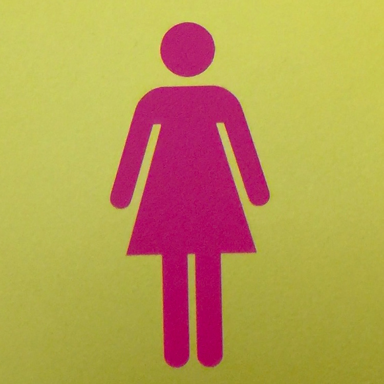 on public signs is more refined and informational than ours. The graphics just tell more and the colors pop. HELLO, I love a country that is not afraid to use hot pink on permanent public wayfinding signage.
Identity & Signage
Iconography was definitely a highlight for me in terms of Japanese graphic design. Unfortunately there was a lot I was unable to capture because of the way we were traveling that day or in more than one instance when I was asked not to take a photo. YIKES. We happened upon this cool collective design office in Harujuku and these were a few of the snapshots I took there.
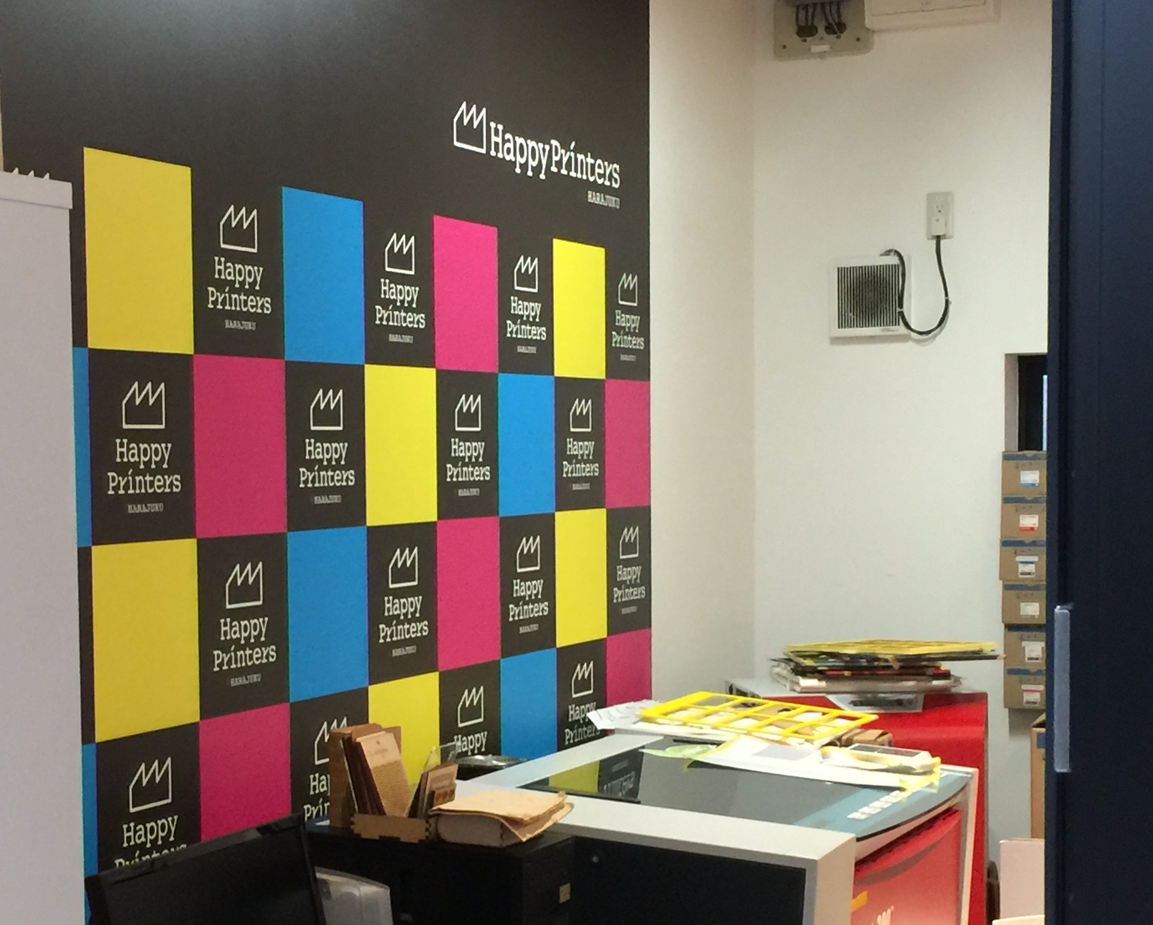
(above ) Cute little print shop with fashionable girls printing on stuff using UV and Latex printers among other equipment. One item of note was a cat face printed on a purse. Major cat situation going on in Japan.
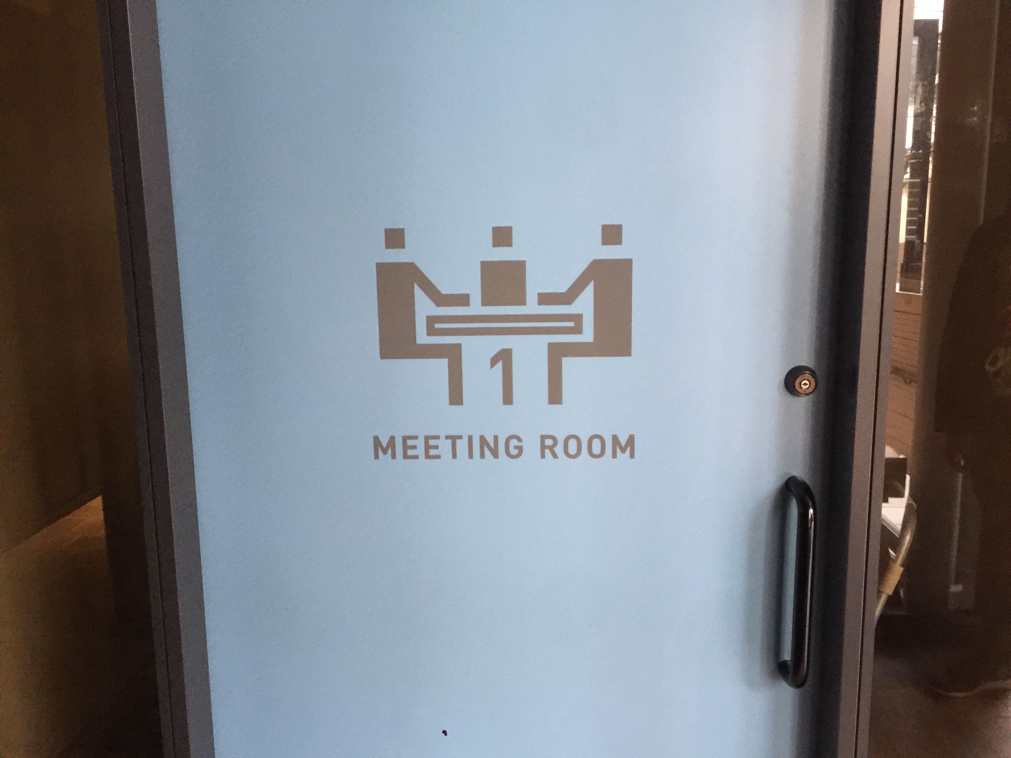
Community Meeting Room 1: I love this graphic and at this juice joint below with a counter that sat two, the hand lettering was on-point for the product.
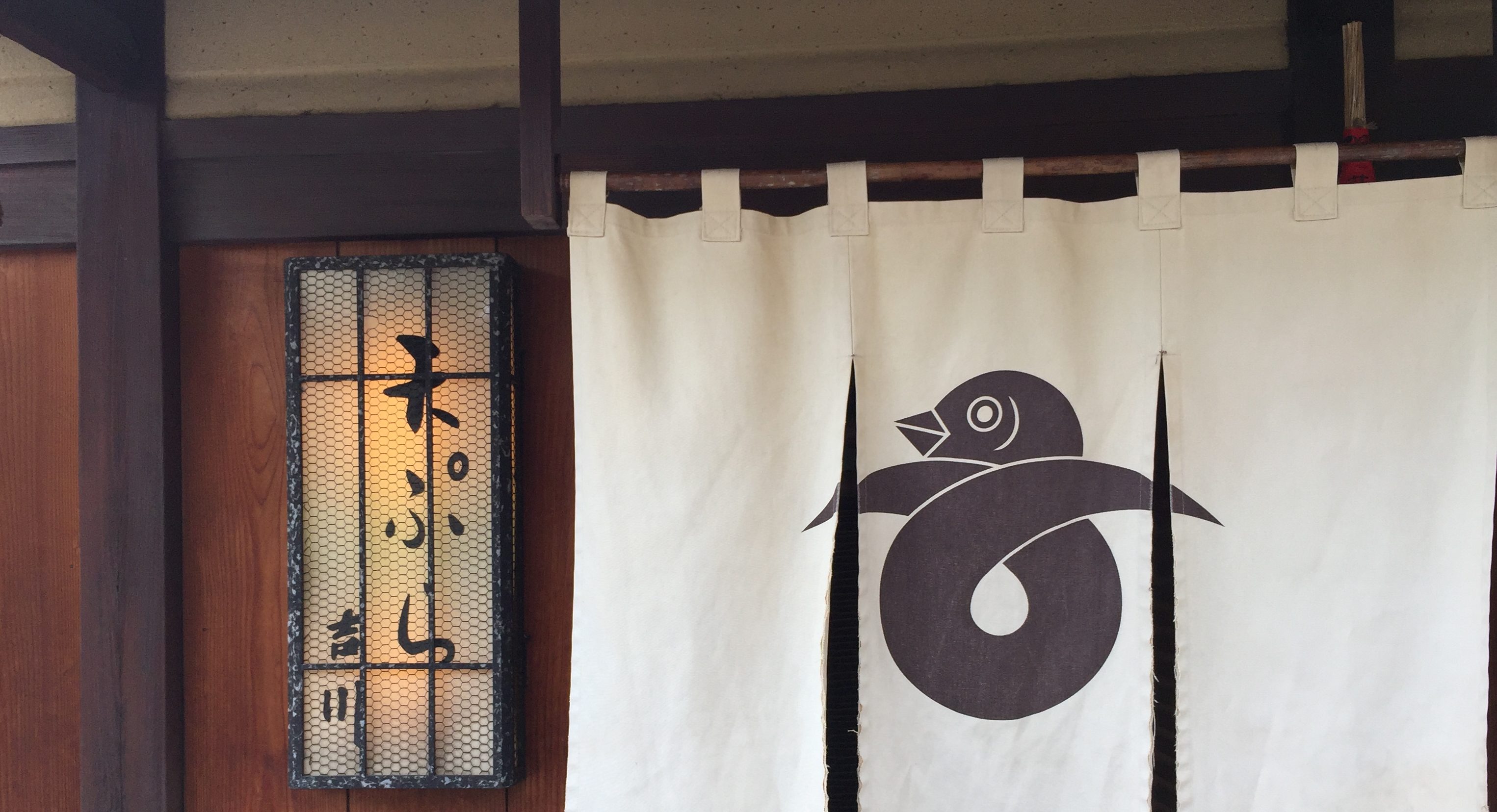
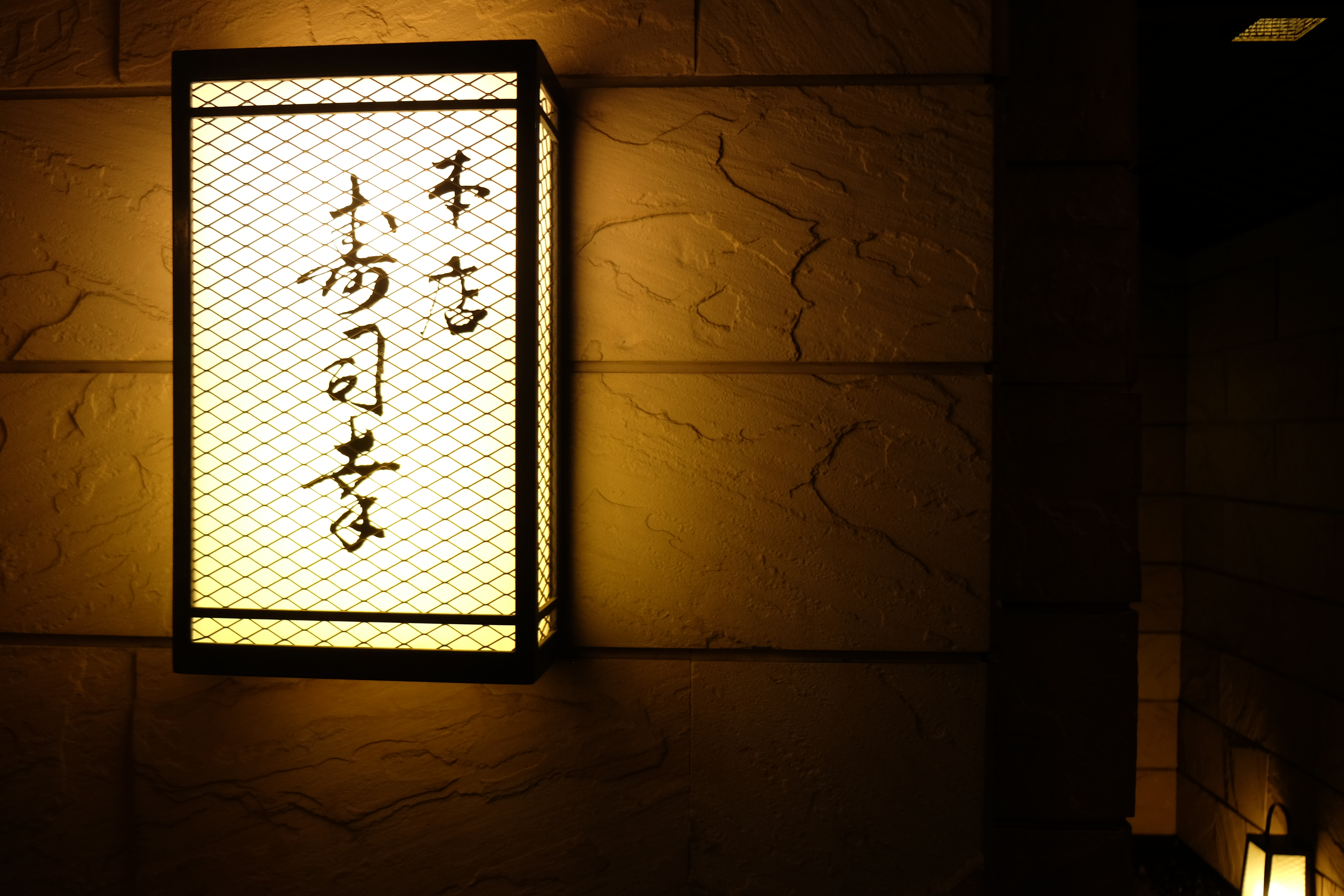
Restaurants and galleries were another source of unexpected design inspiration with the fun, and economical hanging outdoor signage (I am now officially obsessed with) to polished backlit wall mounted signs and cute graphic icons.
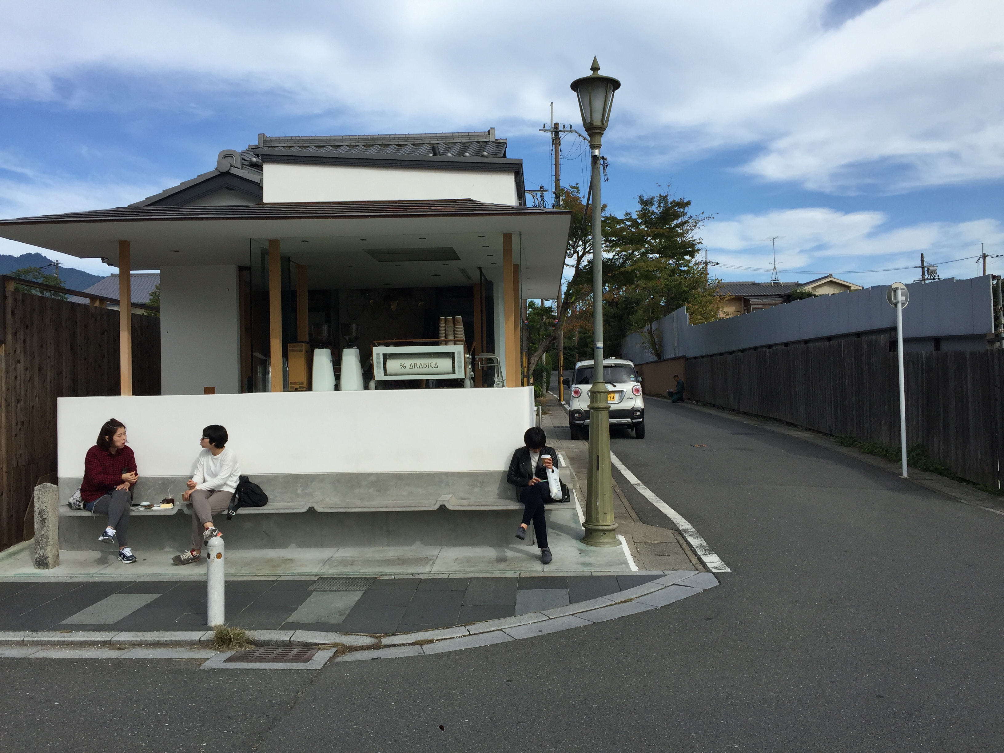
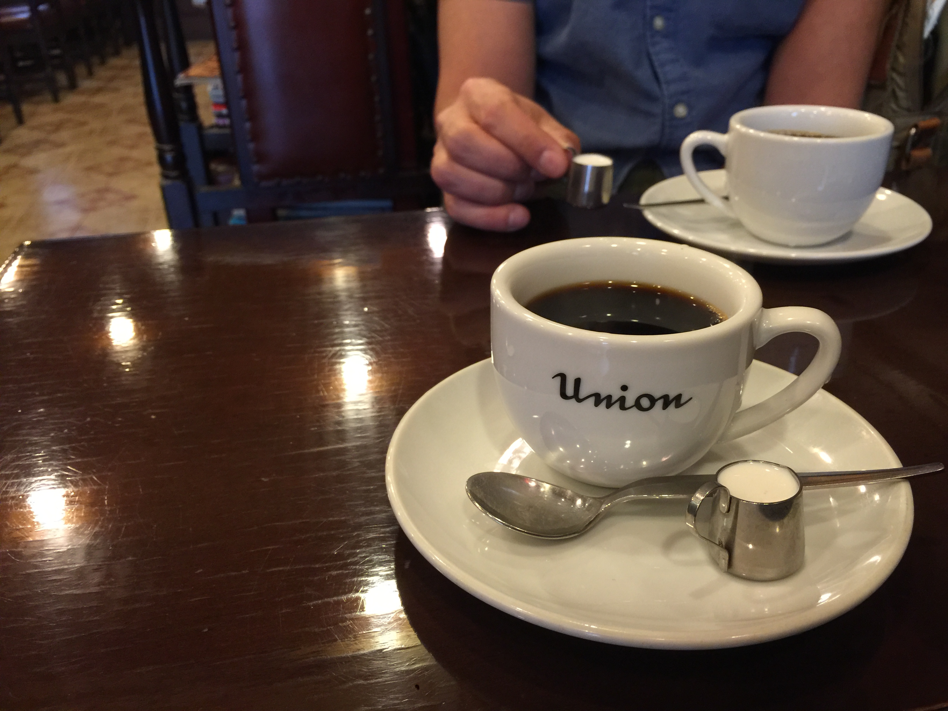
Coffee shops were another graphic highlight. I liked the juxtaposition of the new and old (very Japanese). I love the subtle detail of the cement bench. % coffee shop was the hippest coffee shop I’ve ever seen. Primary palette: gold & white but better than I’ve ever seen it done. While Union had a different charm with a sweet retro font, dark wood, regulars chain smoking throughout, and a stuffed cat in the corner.
That’s not all. I had to break these posts into manageable bits. This is a three part series feat. stationery, books, printing, and packaging. Check out the next installment where we get busy in the studio with an old school letterpress guy.
Back to all posts
