COUNTERCURRENT 2014
Creating a one of kind brand experience for a nomadic nonprofit arts festival.
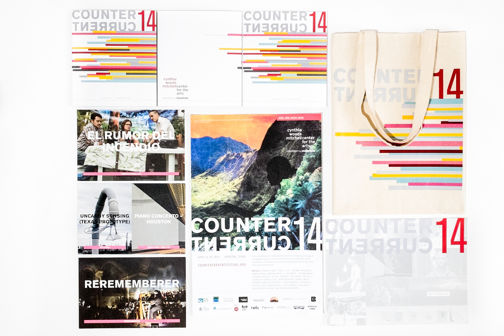
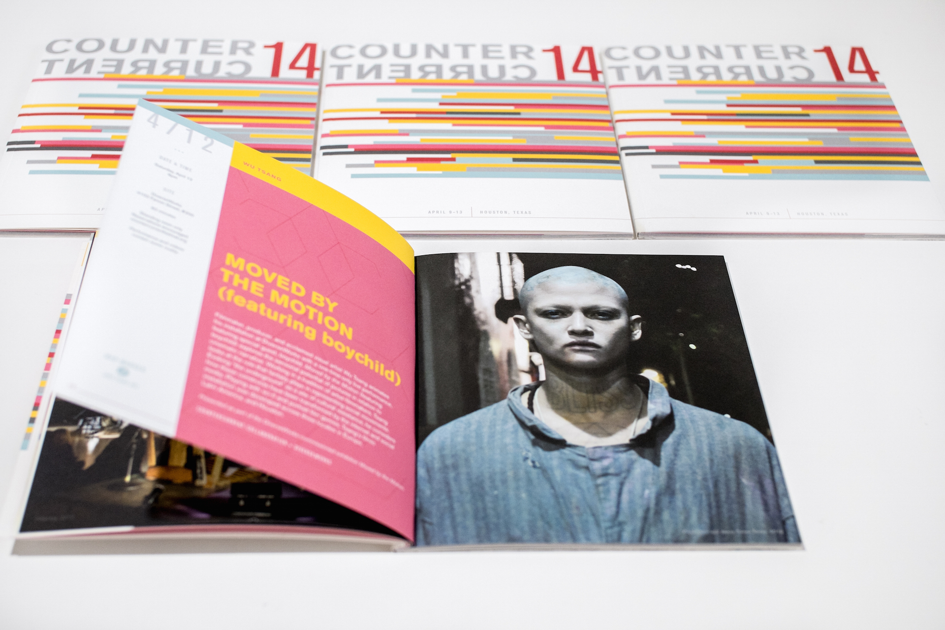
When the Cynthia Woods Mitchell Center for the Arts decided to make bold moves and turn their entire years’ worth of arts programming into a festival format, we jumped at the opportunity to develop the art festival branding for CounterCurrent 2014 (this their inaugural citywide arts festival). Our strategy was to develop bold art festival branding that would represent the experimental nature of the programming with an emphasis on art that is happening in that moment, combining elements of live performance, place, participation, and visual arts to create one-of-a-kind experiences for audiences that won’t be happening in that space or time again. Our goal was to pique the interest of and attract arts insiders and the general arts going public while not straying too far from the Mitchell Center’s visual synergy with the University of Houston’s branding.
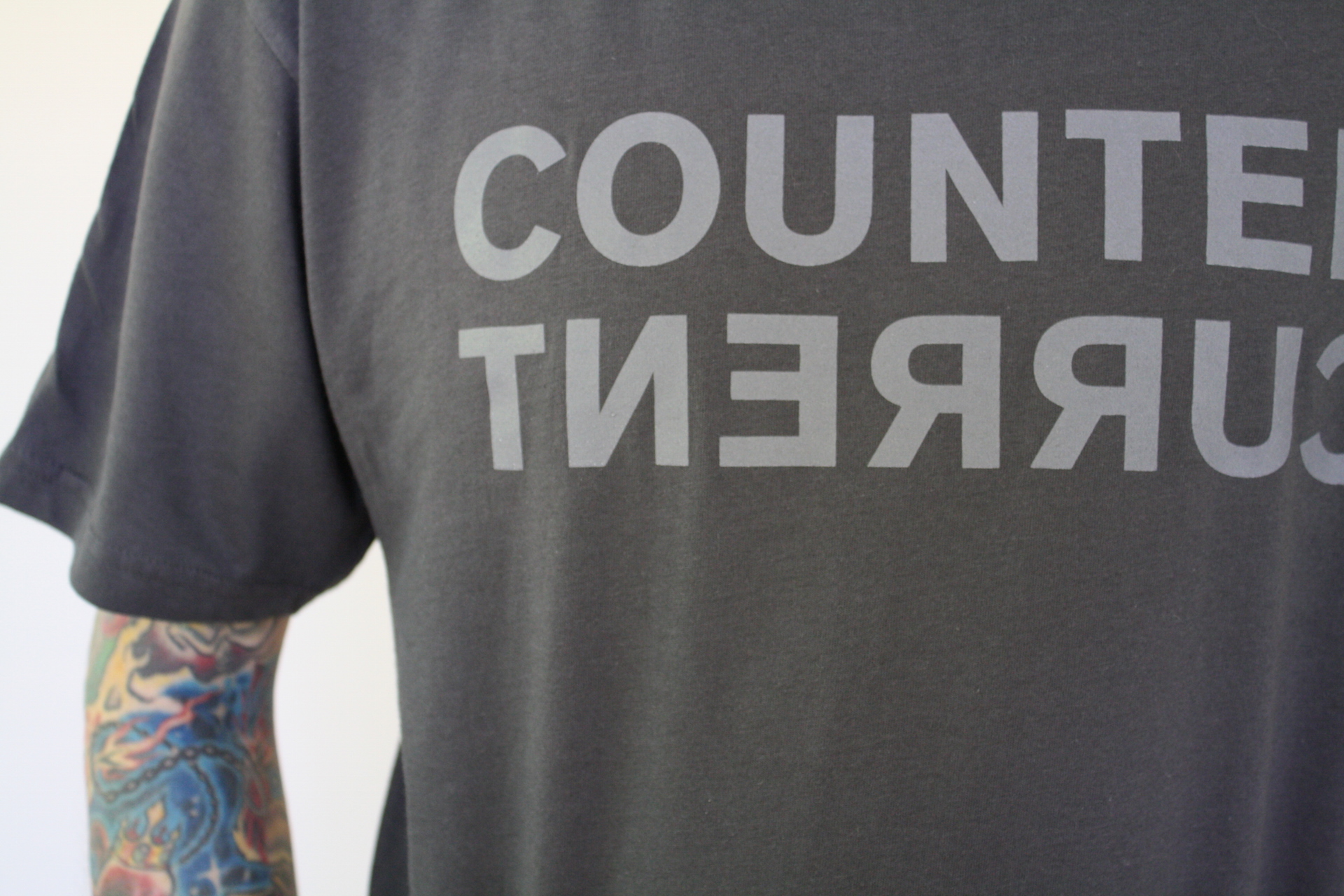
The festival’s flexible identity system was designed in a way that it will change slightly year to year. Very much in-line with the nomadic nature of the festival whose headquarters and most all venues also change annually.
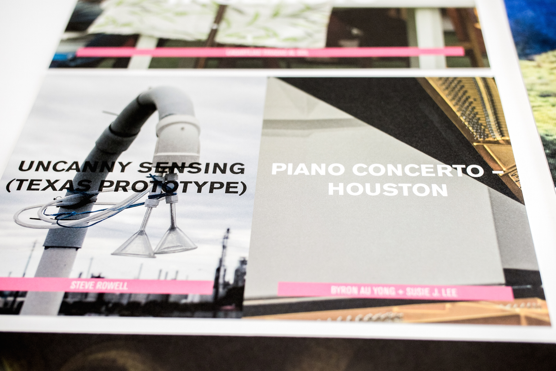
Colors and shapes speak to the idea of movement and to give the illusion of texture (our client being a budget-conscious non-profit wanted to steer clear of special printing techniques). The multi-media campaign consisted of identity, promo items, posters, counter cards, digital marketing, a responsive website, and a 40-page catalog.
TACTICS
visual identity system
responsive website
promotional materials
core messaging
positioning
signage
creative campaign
print collateral design
advertising