This week I am returning from a brief maternity leave. We just had our second daughter, Heron who joined the world on March 22. And although, I have to admit I haven’t been thinking that much about work, time away from my office always brings me perspective. Especially, when I am reminded that returning back to work means that time to reflect is very much a luxury. With the subject of limited time on the mind, I have been thinking a lot about what I like doing and how to do more of that!
Responsive Websites: Is Your Brand Adapting?
One of the things I am most looking forward to jumping back into, are responsive websites. Since my life (over the past two months) has mostly consisted of being a mom, I couldn’t be at my desktop for more than a few minutes…ever. Most of my reading and surfing was done via my iPad or iPhone. Thankfully, using the Internet has become increasingly easier to do thanks to responsive websites. In fact, I really don’t even care to build sites that don’t include this functionality. Yes, I believe it is that important.
My Latest Responsive Website Projects
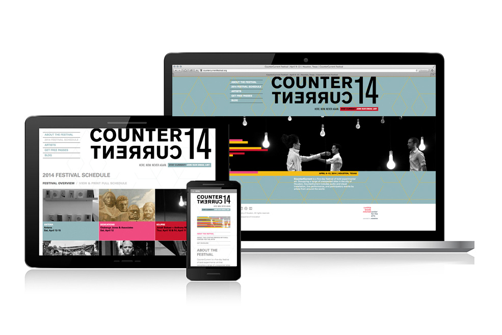
Before I took some time off work, I had worked to complete two responsive web projects that really got me excited. The Cynthia Woods Mitchell Center for the Arts at University of Houston’s CounterCurrent Festival 2014 website and Laura Umansky’s Studio U website are the sites I am talking about. I hope you will take a minute to check them out on your phone and/or tablet as well as desktop. (My site is also responsive.) Both my client’s organizations had very different goals when it came to building their brands, but both are in spaces where responsive websites are few and far between. It’s good to be first.
Process (& Priority) Realignment
Responsive websites and their development have certainly disrupted a process that was years in the making. (I am talking about the way that my team develops websites.) But sometimes it takes disruption to put things into perspective :). For me, as a the client advocate and liaison, I very clearly see that with all the considerations/restrictions/limitations that we have to design with when it comes to mobility, certain aspects of web projects that we used to agonize over… just simply aren’t relevant anymore. Going mobile almost inadvertently causes us all to focus and KISS (Keep it Simple, Stupid!) whether we are talking about design elements or content. In some ways, mobile is driving our process rather than the other way around.
Nonprofits, Responsive Websites Aren’t Just for Ordering Shoes and Books
My nonprofit clients (because of obvious reasons…$$$) will probably be the last to adopt responsive functionality when in reality; they should probably be the first. Reality is that mobile and tablet sales are now higher than desktop computer sales and not only that, but donations on mobile devices have seen a drastic upswing in recent years with all signs pointing toward continued increases. The Blackbaud Index found that online giving increased 14 % in 2013 compared to overall giving which only rose 5%. Network for Good, a nonprofit that helps small to medium sized nonprofits reported online giving increases of 20%.*
People donate to nonprofits for many reasons.
They may:
- believe in what they are doing
- have been asked to
- be motivated by emotion or a sense of community
- receive tax credit
- donate because of a belief in a particular faith or religion
- like to be publicly acknowledged
- feel it improves their social status
But one commonality for all is that they are more likely to give if we make it easy. Responsiveness makes the web experience easy so if you aren’t thinking about your own site in this way, you should be. Frankly, whether you are a new mom, a new CEO, or an avid snowboarder one thing is for certainly, time is of the essence.
* courtesy of Chronicle of Philanthropy
Back to all posts
